Parody Logos
Introduction: This is a project which will demonstrate eight parody logos that I made in my sophomore year for my Graphics 2 Design class. Our task for this project was to chose eight logos and redesign them by putting our name into them. Five of the redesigned logos had to be done with Photoshop and another five with illustrator.
Description: My thought process during this project was to find logos that would not require much time to redesign. I looked at many logos and at many websites to try and find the ones that I liked the most. It didn't take much time until I was able find the logo that I would redesign. In the first class I was only able to finish one logo because I was still kind of confused on the task that we were asked to do. After the first class I came in for lunch to catch up and that's when I understood the task and was able to get back on track.
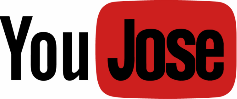
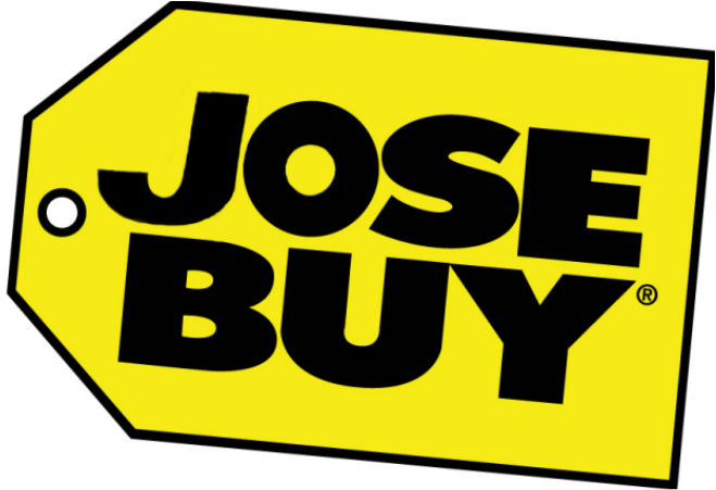

These are some of the logos that I improved
Reflection: throughout this project I feel that I did a pretty good job at using my time wisely. I made sure that I stayed on track with the project because I knew it was going to take time and effort. Because of this I was able to finish my logos on time and turn them in. My projects came out to be better than I thought they would be. Some of the logos were harder than other to make because I couldn't find the font of some logos. Something that I will do next to try and avoid negative results is to try and make sure that the free version of a font is online, because it makes the work so much easier and faster. Some of the things that effected my work habits and time management was that I was not sure of what I was supposed to do. Another reason was because I would be talking to my friends and get side tracked. Overall I think that I did a pretty good job redesigning my logos and staying on task.
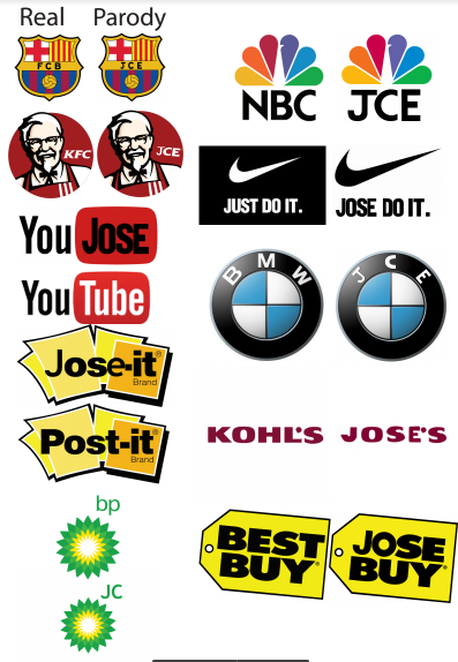
These are the real logos next to the logos that I redesigned.
Program of studies cover
Introduction: This is a project that will demonstrate the front cover of Morristown High School's "Program of Studies". This is a project that I made in my sophmore year of High School for my Graphic Design 2 Class. Our task for this project was to create a simple layout that illustrates Morristown High School and the programs that it offers. This project was made with Indesign CS6. The cover had to fit a 8.5"x 11" piece of paper. If we were going to use a Bleed then we had to make sure that it would still fit a 8.5"x 11" piece of paper after trimming it.

|

|
These two images on top are the Thumbnail sketches that led me to creating my final cover. In the image to the right you can see how I started with drawing very simple sketches, but as I progress throught them, they get more and more detailed. This is because as I drew more and more sketches, my imagination started getting better and better.
Description: My thought process during this project was to use a good Display type so that I could make the the cover as attractive as possible. I also had to find a font with a legibility because that way anyone could read it. I made sure that there was a good Alignment in the title and words in the cover, so that way it looks professional. Another thing that I used was a Gradient on the background because I thought it was to simple to just make it one color. I made the Gradient from maroon to white because those are colors that represents Morristown High School. One thing that I had to look out for in the pictures was that they had a good Resolution because it's important to have good quality pictures. While doing my project I had to keep in mind the Rule of thirds so that way the important things are placed in a good spot to get as much attention as possible. Another thing that I used in my project was a Logotype to show off Morristown High School. One thing that was very important to create the best cover was by making Thumbnail sketches. Another thing that I had to watch out for was that my cover had a good amount of White space because that way everything was not all clamped up together in one place.
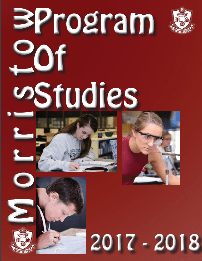
This is an image of how my first cover ended up looking. After my class critiqued my cover, they pointed out that I had cut off the letter "n" in morristown. They also suggested that I should add more pictures because there was too much White space. One more thing that they pointed out was that I should center the title of the cover more so that it looks better by being more central.
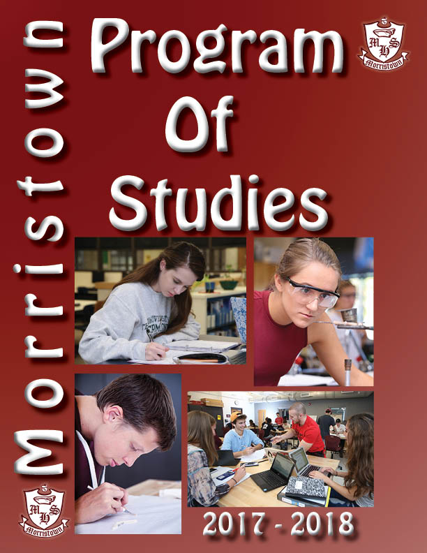
This is my final cover after all of the revisions that I made. I added the "n" that was missing in Morristown. I also made the title more centered as my classmates reccomended. Finally the last thing that I changed was adding a fourth picture to my cover. Overall I believe that I made a pretty good job at creating a cover for Morristown's Program of Studies.
Free Project : Advanced Photoshop
Introduction: This is a project in which our teacher let us decide what we wanted to create. I created this in my Sophomore year at Morristown High School. Our task for this project was to pick a tutorial that would take us 8-10 class periods to make. Our goal for this project was to advance our skills in Photoshop. By following tutorials skills to create a new project of our own topic and creation. This project had to be done in Photoshop.
Description: My thought process through out this was to find the best tutorials that looked interesting and that challenged my skills from Graphic Design. One of the first tutorials that popped up was how to make ART with the pen tool. This tutorial would make a person look like a cartoon. I decided that this would be one of my tutorials to recreate. The other tutorial that I chose to recreate was the Dispersion Effect. I thought that the Dispersion effect looked very artsy and cool. These two tutorials involved something that I had never done before in my Graphic Design class.
Description: My thought process through out this was to find the best tutorials that looked interesting and that challenged my skills from Graphic Design. One of the first tutorials that popped up was how to make ART with the pen tool. This tutorial would make a person look like a cartoon. I decided that this would be one of my tutorials to recreate. The other tutorial that I chose to recreate was the Dispersion Effect. I thought that the Dispersion effect looked very artsy and cool. These two tutorials involved something that I had never done before in my Graphic Design class.
This Image was one of my first versions of the dispersion effect. I had worked on this for about one class period before noticing that the letters of the player's name were missing. I decided to that I had to start all over again, so I started a whole new one. For the dispersion effect I struggled a little more than the other tutorial because I could not figure out how to make the dispersion effect. At the end I asked the teacher for help, and he helped me find what I was doing wrong. I had the mode set on multiply which was preventing the dispersion effect to show, I had to change it to normal.

This is how my final project looks for the dispersion effect. It took me many tries to get the dispersion effect to work. It was definitely a very challenging tutorial to make, which challenged my skills in Photoshop. I am pretty happy about the way it looked, but I think there could be a lot of improvement done to it.

this is how my final project looked like for tutorial about creating ART with the pen tool. I was not able to get an early version of this because this tutorial did not take a lot of time to make. This tutorial took me about 2 periods to make. The most challenging part about this tutorial was making the hair have some texture to it. I based both of my tutorial on soccer players because I love soccer.
Pictogram Music Poster
Introduction: This Project done in my Graphic design 2 class is called Pictogram Music Poster. The main concept of this project was to recreate a poster design that is from an artist called Viktor Hertz. Our task for this assignment was to find an artist that is somewhat popular that has written many songs. We had to chose around 15 to 20 songs from the artist and make symbols that would represent the song's name. Our symbols for the song's name did not have to have any words written on it unless the teacher approved of it.
Description: My thought process throughout this project was to think of artists that I like and that has written many songs that I could work with. The first artist that I thought of was Drake because that's one of the artists that I listen to the most. It was not very hard to find songs that would work for this project because he has many songs to chose from. I looked up all of his albums and looked for songs that would be easy to represent by a symbol.
Description: My thought process throughout this project was to think of artists that I like and that has written many songs that I could work with. The first artist that I thought of was Drake because that's one of the artists that I listen to the most. It was not very hard to find songs that would work for this project because he has many songs to chose from. I looked up all of his albums and looked for songs that would be easy to represent by a symbol.
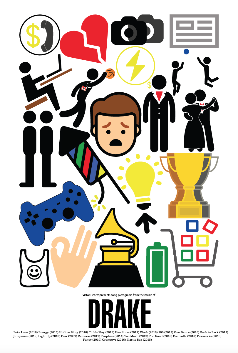
I was able to find mostly all of my symbols from a website called Thenounproject. There was only a couple of symbols that I had to create for myself which were the lightning bold inside the circle, and the hotline bling symbol with the money sign and the phone. There was also the trophies and cameras which I had to make a couple more of because the songs name was plural. I had to come up with a way in which all of the symbols would fit into a rectangular form. I has to work on this for multiple classes to find the best fit for all of the symbols. This is how my final project ended up looking. I was very happy with the outcome because I think that it looks a lot like a Victor Hertz design.
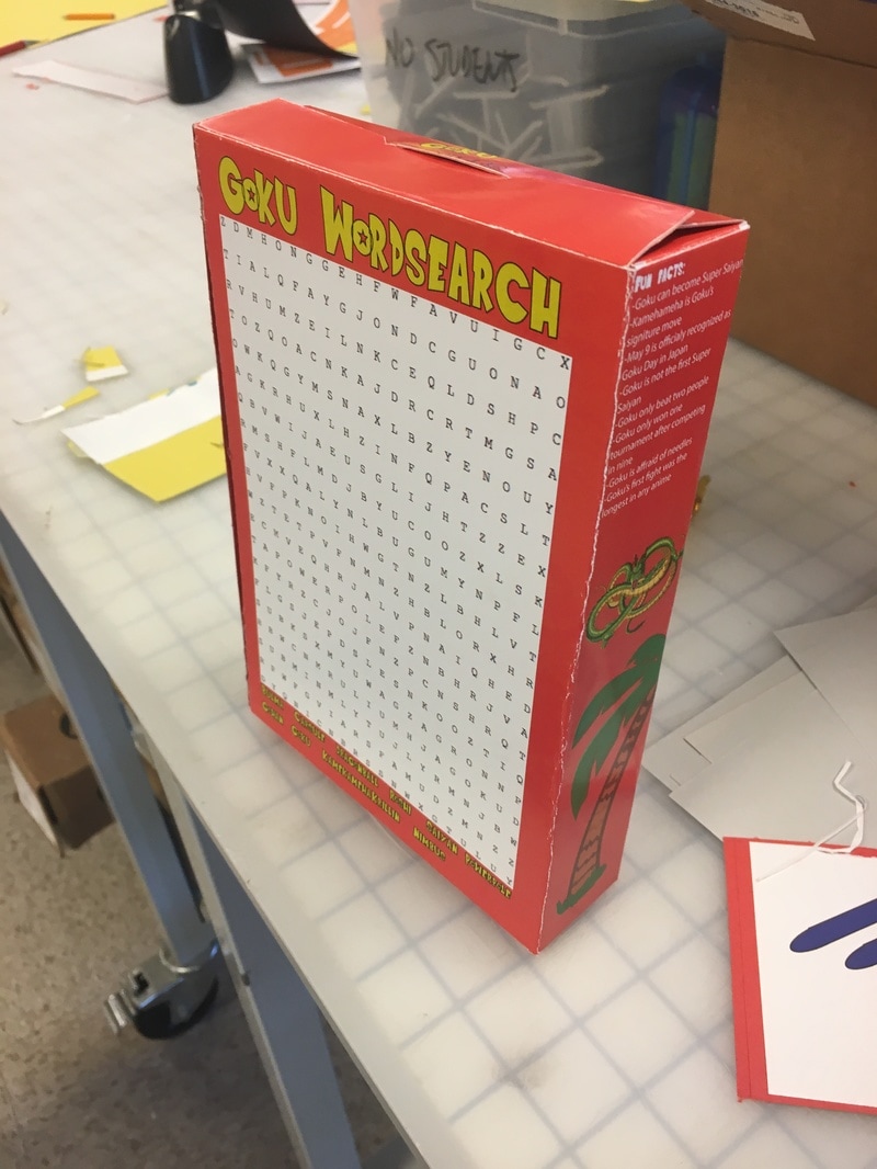
Cereal Box Design
Introduction : This project was a project in which we were able to chose on the topic to make it about. We had to brainstorm ideas about what we were going to make our project about. We had to fill out a google doc that had things that we had to fill out about our project. For example we had to fill out three possible themes that our cereal box could have. We also had to write down 4 possible names that our cereal could have. Think of twenty words or phrases that directly relates to our topic. Forty physical traits that directly relates to our topic. Also we had to write down all the design elements that we would use. This meant that we had to think of twenty things that we would include over our entire design, and what we would fill the white space with.
Description : My thought process through the brainstorming part was to think of subjects that I was interested in and think about how I could turn it into a cereal. Thinking about three possible themes and four possible names was pretty easy to do. I had trouble coming up with twenty words or phrases that directly related to my topic. I also had trouble thinking of 40 physical traits that related to my topic and ended up not meeting the requirement. After brainstorming ideas, I decided that I was going to make a cereal box about the anime show Dragon Ball.
Description : My thought process through the brainstorming part was to think of subjects that I was interested in and think about how I could turn it into a cereal. Thinking about three possible themes and four possible names was pretty easy to do. I had trouble coming up with twenty words or phrases that directly related to my topic. I also had trouble thinking of 40 physical traits that related to my topic and ended up not meeting the requirement. After brainstorming ideas, I decided that I was going to make a cereal box about the anime show Dragon Ball.

This is how my final project looked. I decided that I was going to three of the characters on the design. I also named my cereal "Goku Puffs". I had to look for a website online which would let me create a word search to add to my design. Overall I really liked the design that I ended with. I think that this project was very fun to create because you have the freedom of making it about whatever you like. Also I had to research about thing that a cereal box design has to make sure that my design looked real.
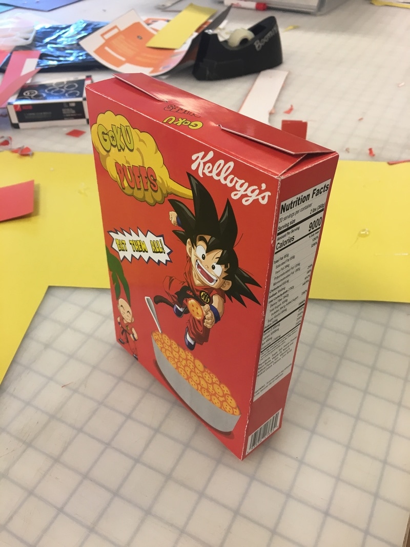
This is how my cereal box design looked after it was cut out and glued to a piece of card board. I designed the box very well so that you could open and close it like a regular box. This way I did not have to completely hot glue the whole box so that you couldn't open it anymore.
|
|
